The Opening Titles
Ti meslip‘s title sequence is one of those simple yet iconic visuals that 60s and 70s television is still famous for.
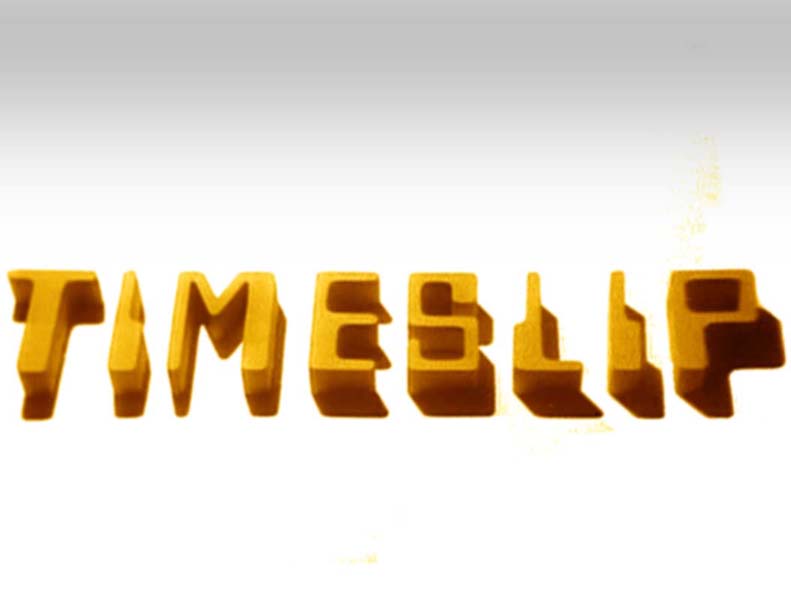
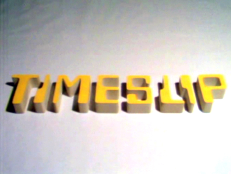
Three dimensional yellow blocks of computer lettering on a flat off-white landscape spell out the series title as a rapidly moving overhead light source casts shadows, short and long, across them – depicting the rapid passage of time.
This simple and short graphic was re-recorded twice during the course of the series . This occurred during the first episodes of The Time of the Ice Box and The Year of the Burn Up. For The Wrong End of Time, each time the positioning of the individual letters differed slightly. The end titles remained virtually the same throughout the series’ run. Only the background images changed to reflect the story. The Timeslip logo filled the top quarter of the picture and the cast and production credits rolled upwards and disappeared into it.
The story title and writer credits differed for each of the four stories.
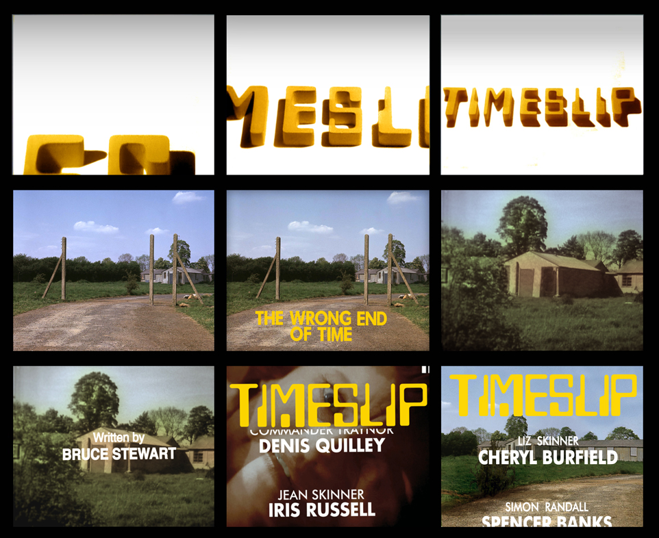 For the opening of The Wrong End of Time, the familiar shot of the fence posts in the ministry field was used for the title whilst a closer angle on one of the outhouses (specifically the one at the centre of the first image) was used for Bruce Stewart’s credit. For the closing titles, a number of different backgrounds were used under the credits. For part one, the camera held on a shot of the working radar screen in 1940 before fading to black. For part two, it was a an extreme close-up shot of Jean Skinner’s reaction to the Liz’s jeopardy at the naval base as she attempts to escape. For part three, it was same photograph of the out building used for the writer credit but a wider view of it. The rest of the episodes used a black background.
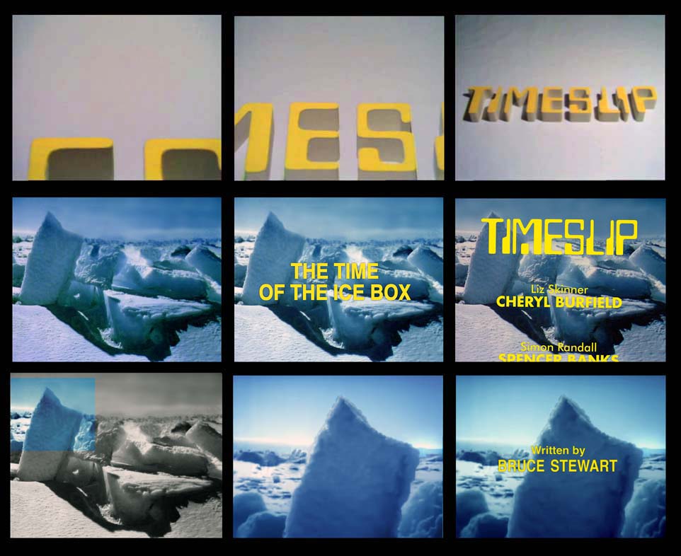 For The Time of the Ice Box, the title caption appeared over a colour shot of an ice scape which was apparently taken from an issue of National Geographic. The writer credit appears on the same photo but zoomed into the upper left. For some reason, the writer credit is missing from part six of the story. The end credits were run over the same ice field photo as the title caption.
For The Year of the Burn Up, both credits are overlaid onto a glowing ball – presumably representing the sun. The sequence starts with the sun to the right and the caption for the title to the left. The 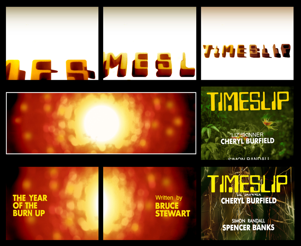 lettering then dissolves as the camera pans to the right and the writer’s credit appears left with the sun in the right of frame. The end credits for the first six episodes were run over shots of vegetation which became dryer looking and sparser as the serial progressed. By episode six, the vegetation was virtually a handful of empty twigs. For part seven, a wide shot of the glowing ball graphic from the opening titles was used and for part eight, the credits rolled over black.
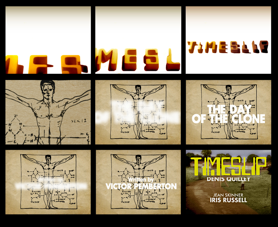 For Day of the Clone, the opening captions are overlaid onto a diagram of what appears to be the Traynor clone (a rather blatant hint at what is to come?). For episode one, the captions are small in a standard size font similar to the previous stories. For the following episodes, the captions are in a larger font and appeared blurred before focusing and becoming legible. The end credits rolled over the clone diagram for the first five parts whilst for the final episode, they ran over the final overhead wide shot of Liz and Simon leaving the ministry field before fading to black.
Two caption slides were employed for the commercial break. These were the Timeslip logo with either the words “END OF PART ONE” or “PART TWO” underneath it in the font Eurostile – the same font used on several of Gerry Anderson’s shows at the time.
Andrew Mark-Thompson
When laying out the letters of the ‘TIMESLIP’ logo for each version of the opening titles, the person (whether by design or in error) got some of the letters wrong.
 The Wrong End of Time: The two “I“s and the “M” are back to front and the “S” is upside down.
 The Time of the Ice Box: The “M” is back to front and the second “I” is upside down. The letters are also much closer together.
 The Year of the Burn Up/Day of the Clone: The two “I“s and the “M” are back to being back to front but the “S” is now the right way round. The letters are now further apart than the previous two attempts.
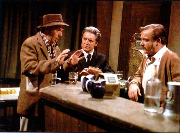
The letters for the title sequence were set out in the studio on one of the sets at the beginning of each of the first three stories. For episode one of ‘The Wrong End of Time’, they were placed on a table in the pub set. They can be seen behind John Garrie in this publicity still.


![]()